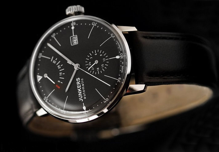
Junkers Bauhaus 6060-2 Review
 Hugo Junkers was a German engineer and aircraft designer who is widely credited with designing the first all-metal aircrafts. As founder of the Junkers Flugzeug- und Motorenwerke AG, he was one of the central figures in the German aircraft industry in the years between World War I and World War II. As an outspoken pacifist, Hugo Junkers was not interested in designing warplanes and instead focused his efforts on the development of multi-engine passenger and cargo planes, helping to establish airlines in Germany and all over the world. Although his name is linked to some of the most successful German warplanes of the Second World War, Junkers himself had nothing to do with their development, as was forced out of his own company by the Nazi government in 1934 and died shortly after.
Junkers was not only a brilliant engineer, but also a great admirer of expressionist painting and modern design. As one of the main sponsors of the Bauhaus movement, he developed a close and fertile connection with the artists of the era, helping to facilitate the move of the Bauhaus from Weimar to Dessau, Germany (where his factory was situated) in 1925. Faithful to the motto of Marcel Breuer, “The good artist works together with the good engineer,” Junkers adopted the high aesthetic claims of the Bauhaus movement in everything he did.
As with many watch genesis stories, Junkers watches are firmly tied to aviation history. Spending his life designing airplanes, avionics and dials, it’s only natural that this would eventually lead to watches. Even though by this time the founder was long gone, I think his legacy can be seen in the design choices incorporated in the watches bearing his name.
The Junkers Bauhaus 6060-2 (in black) and 6060-5 (in cream) are automatic watches with a power reserve, 24-hour and date function and hacking seconds. While many people believe the Junkers Bauhaus watches lean too heavily on the Max Bill designed watches, flippantly referring to them as a “Poor Man’s Max Bill”, I think they have a personality and design all their own. Whichever side of the fence you land on, it’s hard to deny that Junkers Bauhaus watches offer a classic Bauhaus design at a great value.
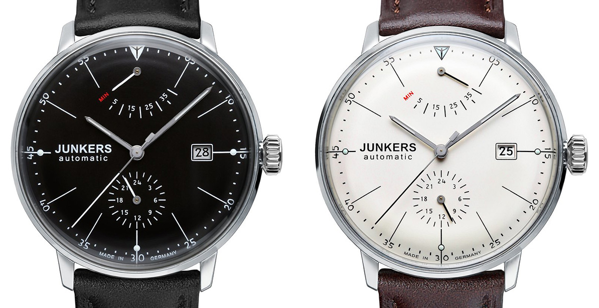
As with all my reviews, I don’t feel comfortable casting judgement on any watch I can’t get my hands on and wear for at least a week. Fortunately, the folks at Junkers (more specifically their manufacturer POINTtec) were nice enough to send me a sample to review.
Crystal:
[hr style=”striped”]
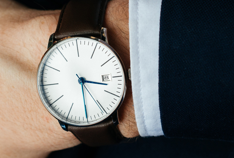
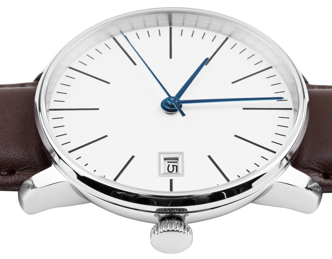
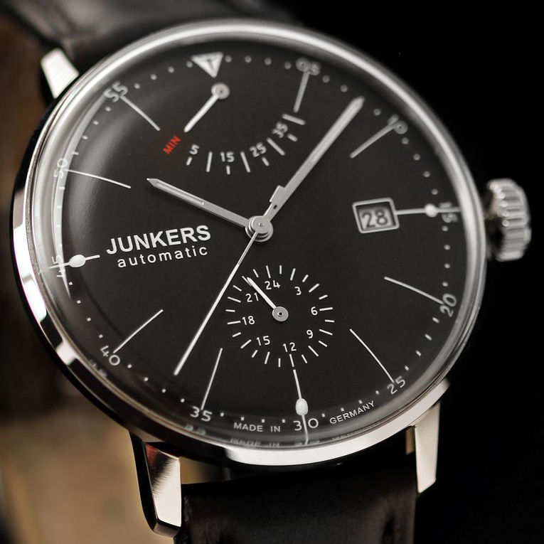
The crystal on the 6060 is one of the first features you are likely to notice. It is made from domed Hesalite that stands proud of the case and drops down approximately 3mm before connecting with an extremely thin bezel. The effect is that there is no bezel at all and the entirety of the face is taken up by the acrylic. Looking through the crystal at an angle reveals the inverted reflection of the dial below, which further accentuates the round pillowy-ness of the dial. Some people might not like the use of Hesalite on this watch, but with the peculiar shape of the crystal, sapphire would be both extremely expensive to produce and prone to shattering.
Bezel:
[hr style=”striped”]
The bezel of the Junkers 6060 is thin at a mere 1mm. The interior wall of the bezel is short and polished to a high gloss. The combined effect of the polished interior wall of the bezel and the curved crystal makes it such that you don’t even see the wall and, instead see a reflected, inverted image of the dial. This isn’t subtle at all. It stands out and for the first few minutes I was inspecting the watch I actually thought the dial was rounded instead of flat. This is one of my favorite aspects of this watch.

Case:
[hr style=”striped”]
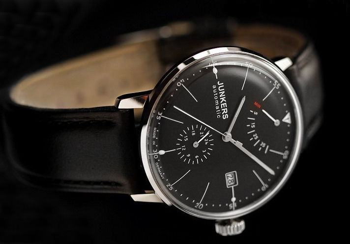
The case has nicely balanced, though somewhat diminutive proportions overall. This may sound like a criticism, but in the context of a Bauhaus watch, diminutive case proportions are necessary. The unbalanced, weighted proportions of the dial and crystal make for a top heavy look that is generally preferred; the case is small so the dial can be large, the bezel is thin so the crystal can be substantial, and the lugs protrude from below so they don’t add to the visual weight of the case. In my opinion, this is all as it should be. Despite the small size, the case still wears comfortably on my 7 inch wrist.
On profile, the case has a pie-pan shape with the lugs protruding from the falling slope of the side wall. When viewed from above, it looks as if the lugs protrude from behind and below the bezel, lending to the prominence of the dial and crystal.
Dial/Hands:
[hr style=”striped”]
The dial on the 6060-5 has a nice ash-black background with finely printed crisp white text, numbers and indices. Instead of marking the hour positions with numbers, the dial presents long thin lines and prints the minutes around the perimeter of the dial in 5-minute intervals. This draws your eyes to the outer edge of the dial where the numbers sit on the periphery of the curved dial illusion caused by the glass and the polished interior case wall.
The hands are all polished silver baton-shaped hands with super-luminova present on the hour and minute hands. The second hand, 24-hour sub hand, and power reserve sub hand are all painted with the same crisp white paint as the dial. My only problem with the hands would be that everything on the watch uses the same crisp white color with the noticeable exception of the hour and minute hand, which have the dull white of untreated super-luminova. The pips on the dial and the Junkers logo at the 12 o’clock position also glow with the same brightness as the hands, and were apparently treated so to appear as crisp white as the rest of the dial. This makes me think that the hands were simply ordered from the manufacturer as-is and weren’t given the same white paint treatment. I wish they had taken the same efforts with the hands as they did with the dial. It would have made for a more uniform color palette.
Lume:
[hr style="striped"] The lume is actually quite bright, and I'm happy that Junkers went with blue over green. I feel like blue has a cleaner more antiseptic feel to it than green, and this, in my mind, fits well with the overall aesthetics of the watch. My only complaint, as mentioned earlier, is that I wish the lume on the hands had the same white paint appearance as the lume on the dial. This felt like a missed opportunity, and is noticeable on the black-dial version. Junkers also took the opportunity to apply lume to their logo, which I am not normally a fan of, but since their logo is symmetrical and sits at the 12 o'clock position it serves as both a 12 o'clock position marker and nod to the company brand. I'm happy to say this is the single best use of an illuminated logo I've seen in a watch. I like it a lot.
Crown:
[hr style="striped"] The crown is fairly standard with a rectilinear profile and slightly domed end. Looking at it straight on, the Junkers logo is engraved, which gives it a nice touch. The interior portion of the engraving has a whitish color to it, which I thought was lume at first. I believe it is a bead blasting of some sort and looks nice, though I don't know how well it will wear.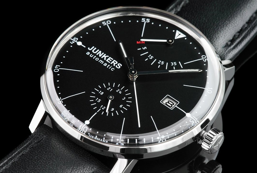
Strap:
[hr style="striped"] The strap is a black calfskin leather with a thorn buckle, features a nice taper and was soft and pliable right out of the box. The back of the strap is stamped with "Fatta a mano Cuoio Natural." I believe this means "handmade natural leather" in Italian. I'm not sure where the straps are sourced, but I have no complaints with the fit and finish.Movement:
[hr style="striped"] The movement that came with my watch is a Miyota's caliber 9132, which is a sturdy, reliable movement. This movement gives you hours, minutes, hacking seconds, a 24-hour function, date and finally, a power reserve indicator. That's a lot of complications packed into an affordable watch. I believe the movement also has a day function, which Junkers has opted not to use; a good decision since the dial is already packed with features. One issue I've had with this movement in the past is the noisy rotor that is, unfortunately, extremely noticeable with this watch. It is so noisy, in fact, that at first I was worried there was something loose inside the watch. I think there are multiple factors combined to make this watch so noisy. One is simply that this movement has a noisy rotor; however, I think the unique properties of the small case and large crystal exacerbate the problem. Normally, I don't mind being able to hear a rotor spinning, but this thing is LOUD. Loud and cheap sounding. It has the sound of metal ball bearings bouncing around in a plastic enclosure.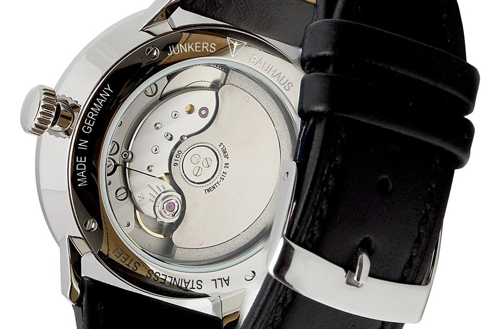 With that said, there are some positives here, too. The Miyota movement has a nice Côtes de Genève decoration, which is always nice.
When the crown is fully depressed, winding it will engage the mainspring and wind the watch, which is satisfying since you can noticeably see the power reserve climb with every revolution. It takes approximately 40 turns of the crown to fully wind the watch. The second crown position sets the date, and the third sets the time, which simultaneously sets both the 12-hour and 24-hour hands. The date function is smooth and the transition snaps over at the 12 o'clock position rather than "dragging" like some movements tend to do.
With that said, there are some positives here, too. The Miyota movement has a nice Côtes de Genève decoration, which is always nice.
When the crown is fully depressed, winding it will engage the mainspring and wind the watch, which is satisfying since you can noticeably see the power reserve climb with every revolution. It takes approximately 40 turns of the crown to fully wind the watch. The second crown position sets the date, and the third sets the time, which simultaneously sets both the 12-hour and 24-hour hands. The date function is smooth and the transition snaps over at the 12 o'clock position rather than "dragging" like some movements tend to do.


Accuracy:
[hr style="striped"]